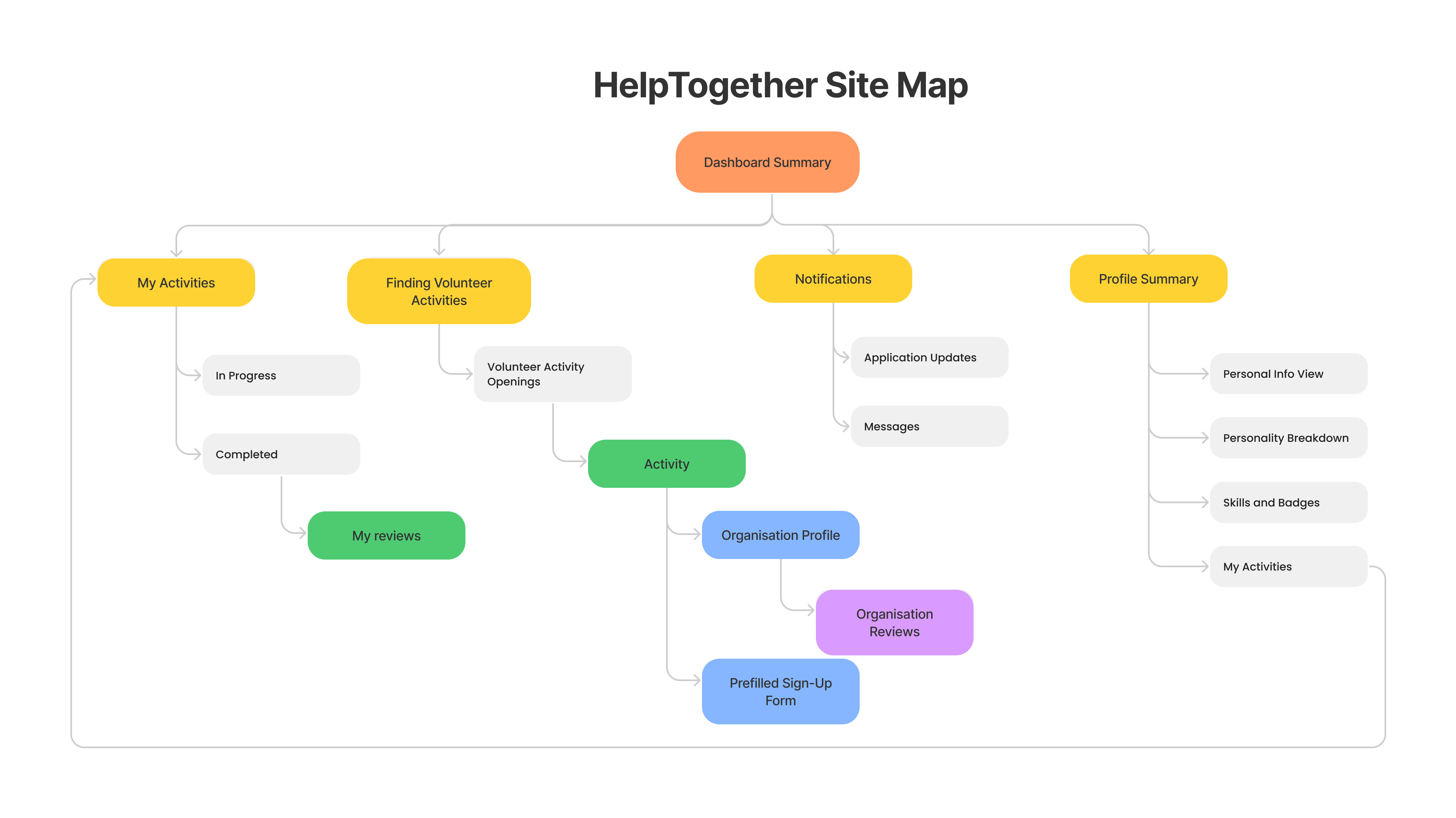
Initial Site Map that we Prototyped
About The Project
Help Together was built over the Semester for the module: “Interaction Design and Prototyping” (IDP). The task was to find a problem and attempt to design a solution that tackles the crux of the problem. My team and I settled on the search-and-match problem amongst Youth Volunteerism. The application was designed for mobile screens, mainly for IOS.
In this 2-part series, I will cover the entire Design Thinking Methodology that my team and I used, from the conceptualizing of the problem statement to the Hi-Fidelity Prototyping using Figma.
Part 1 will cover the initial low-Fidelity (paper) prototyping phase, while Part 2 will focus on the Hi-Fidelity stage and the statistical Analysis we used.
Intro to Design Thinking
Design Thinking consists of mainly 5 stages.
- Empathy (Understanding your users)
- Define (Defining your requirements and user breakdowns)
- Ideate (Solutioning)
- Prototype (Creating of your prototype)
- Test (Testing your prototype using Heuristic Evaluations, User Studies, and Statistical Analysis)
Note that Design Thinking is an iterative process, and the 5 stages will not necessarily be completed in order.
Empathy and Requirements (Define) Stage
We started with the problem statement below:
“Youths want to volunteer at a place where they can create the most impact and also volunteer together with friends whom they are comfortable around”
We observed that our current understanding of our target user group is lacking and decided to double down on understanding the users in greater detail as our priority.
We began understanding our target users by first scoping the main boundaries. We condensed our target audience to be youths between 17 - 24 who are ideally current tertiary or undergraduate students. This age group is not only the easiest for us to understand given the relative age difference, but also follows a very similar stage of life where most have the primary activity of the school curriculum. This allows us to be confident that the insights are due to differing perspectives and not differences in stage of life or environmental influence.
The team then proceeded to conduct our interviews. Halfway, we considered race/religion as some of our interviewees noted that religion was the main propellant for their volunteerism.
After interviewing 20 participants, we reconvened to share our insights. We confirmed that our original hypothesis was wrong and that pre-existing knowledge of volunteering opportunities was a common trend. We redefined our problem statement to reflect this knowledge, as well as a “how can we” perspective to give us an actionable way to work towards it.
New Problem Statement
“Youths who want to volunteer currently face difficulty searching and signing up for volunteering opportunities beyond their limited knowledge. Given this, how can we help youths discover suitable volunteering opportunities more efficiently, and make youth volunteerism more accessible and convenient?”
With confidence in our problem statement, we consolidated our interviewees’ responses by identifying the common breakdowns. Listing them out allowed us to classify the common issues into 5 specific categories, namely: (1) Mismatch (between volunteers and organization), (2) Credibility (of organizations), (3) Not enough information (of opportunities), (4) Troublesome administrative, and (5) Marketing (lack of).
We created our Personas and Scenarios and proceeded to move on towards creating our Paper Prototypes.
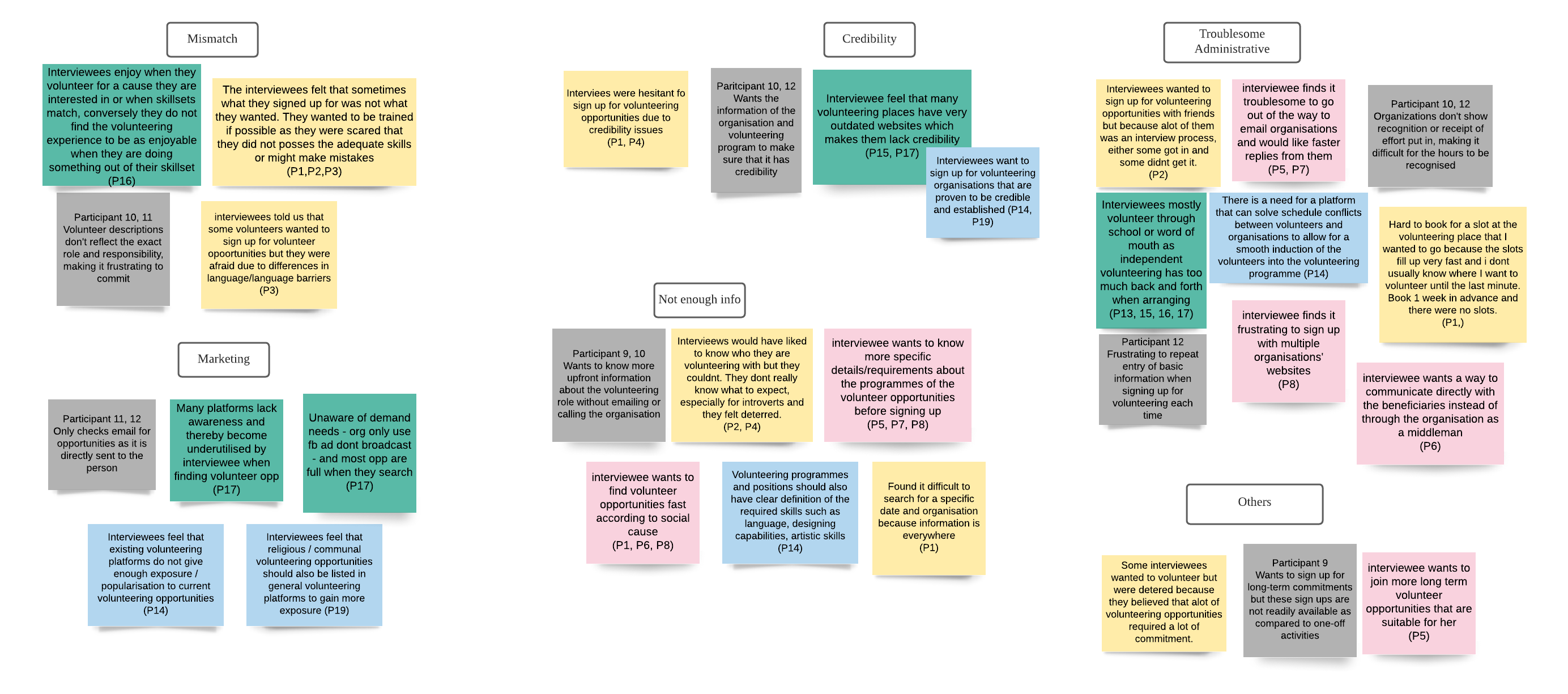
Target User Breakdowns after rounds of divergent and convergent brainstorming.
Ideate Stage
We proceeded to do another round of solution brainstorming, to come out with viable solutions which could tackle the User Breakdowns that we had observed.
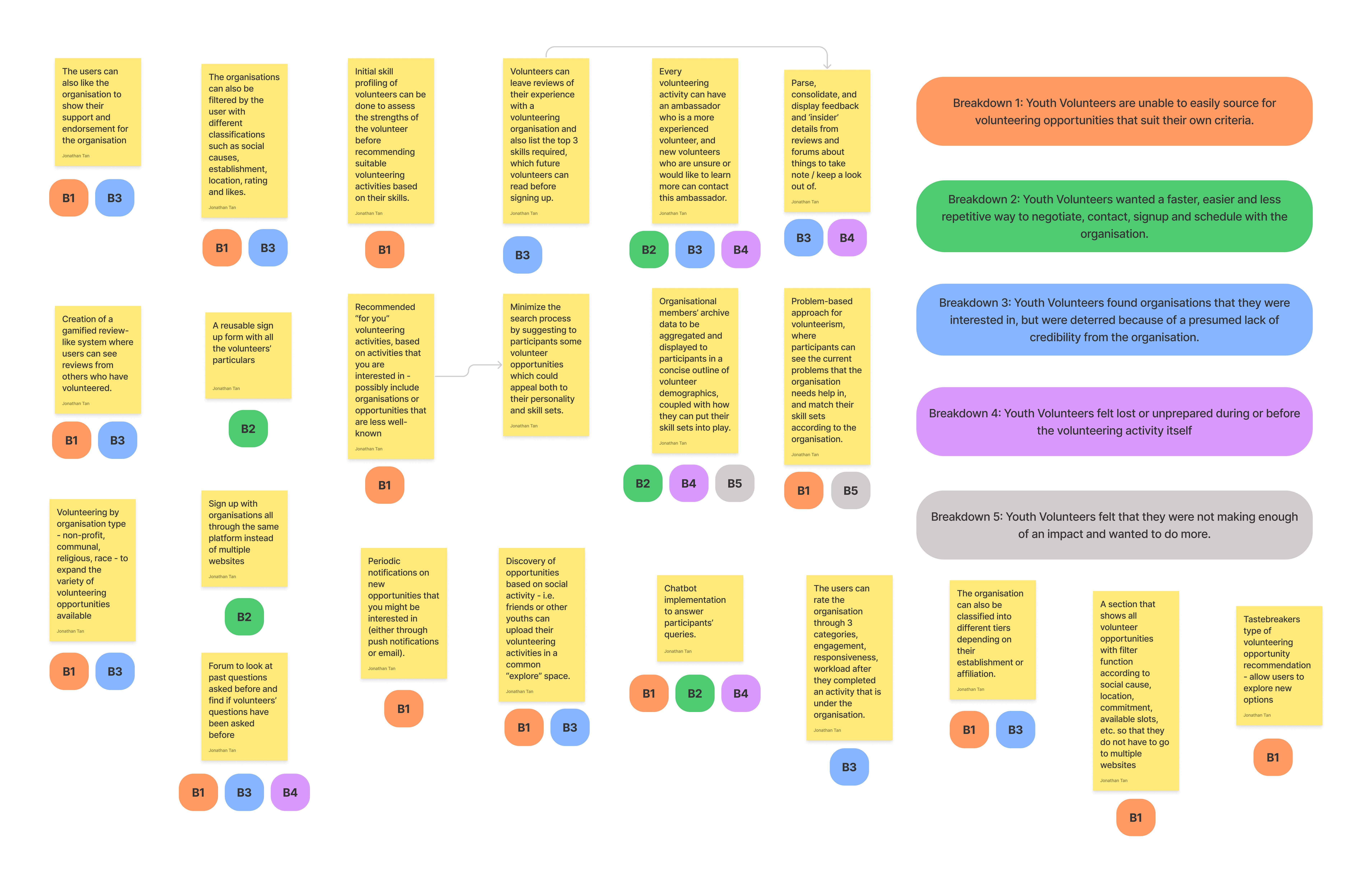
First solution space we came out of during the brainstorming session.
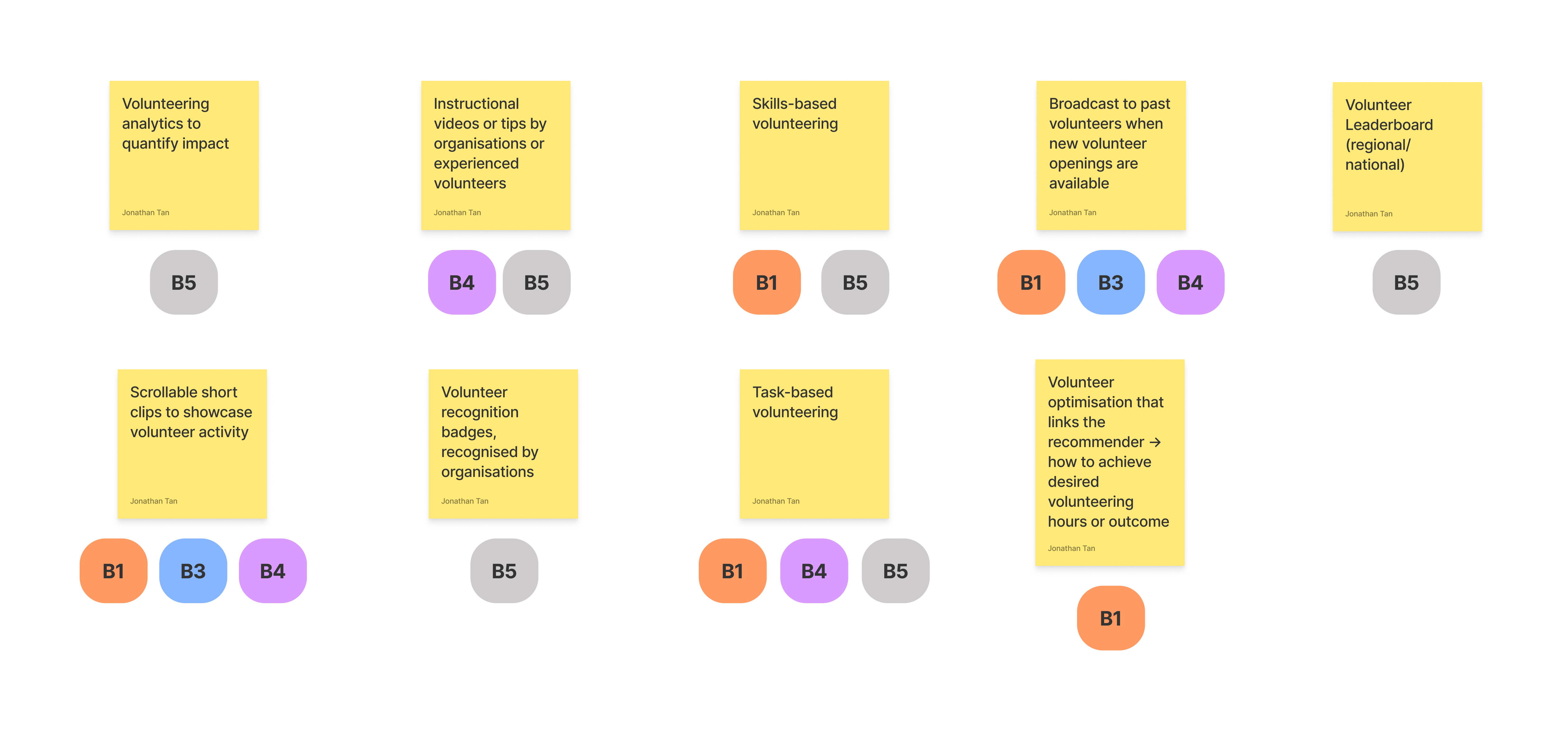
Second solution space we came out with during more brainstorming sessions.
Once we finalized our solutions, we crafted our Customer Journey Map and the App Flow Diagram as shown below. The Customer Journey Map allows us to understand the life cycle of our users, and the App Flow Diagram gives us an overview of how the app components interact with each other.

Customer Journey Map for HelpTogether (Low Fidelity Prototyping)
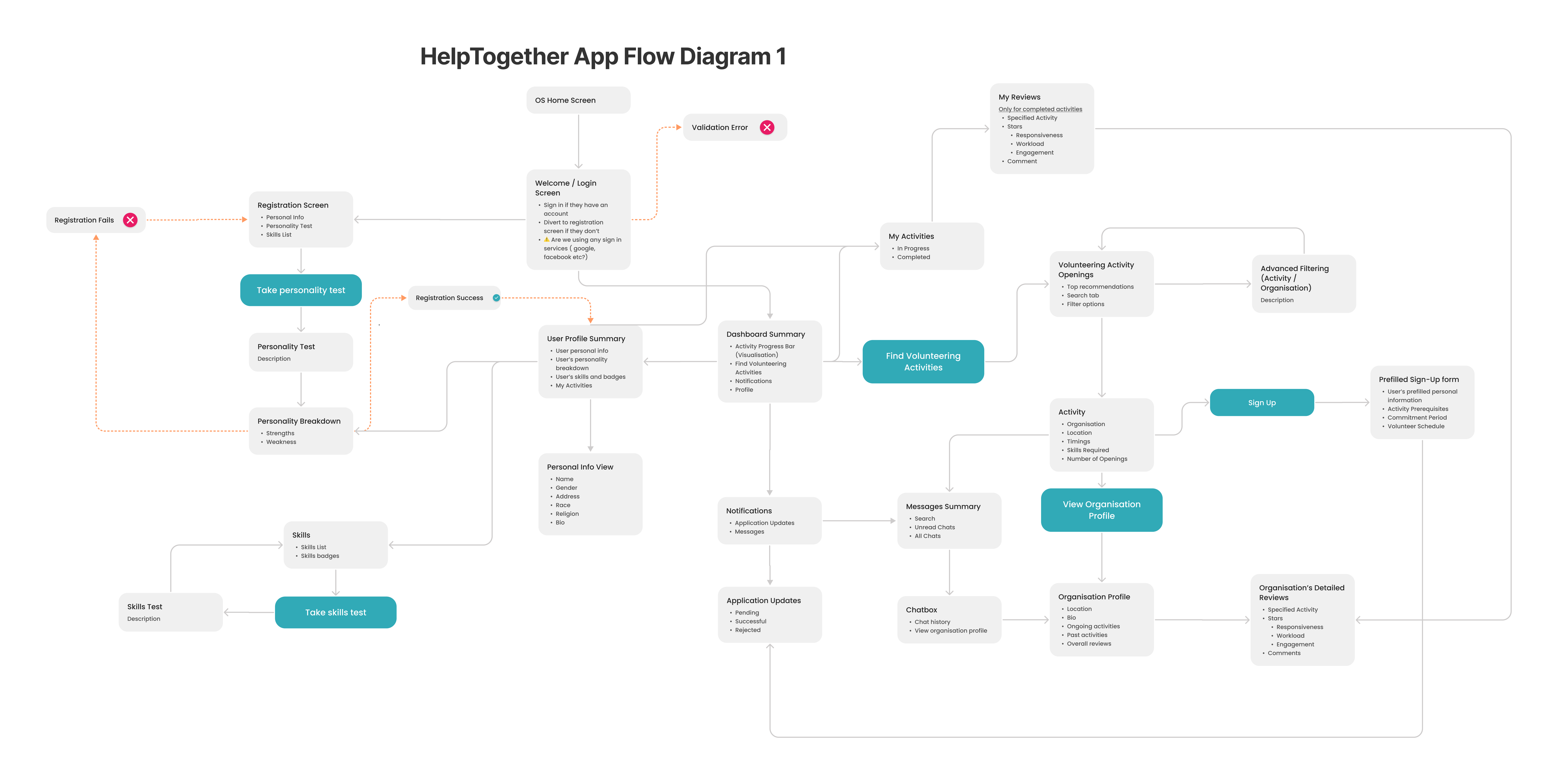
App Flow Diagram for HelpTogether (Low Fidelity Prototyping)
Prototyping (paper-prototyping) Stage
We moved on to creating our Paper Prototypes. Paper prototypes, although lacking a polished design, serve mainly 2 key purposes: 1) It allows changes to be made easily 2) It helps to sieve out non-UI functional issues. In a full prototype, users might be overly conscious of the less important details such as colors or fonts and miss out on important issues like form and function.
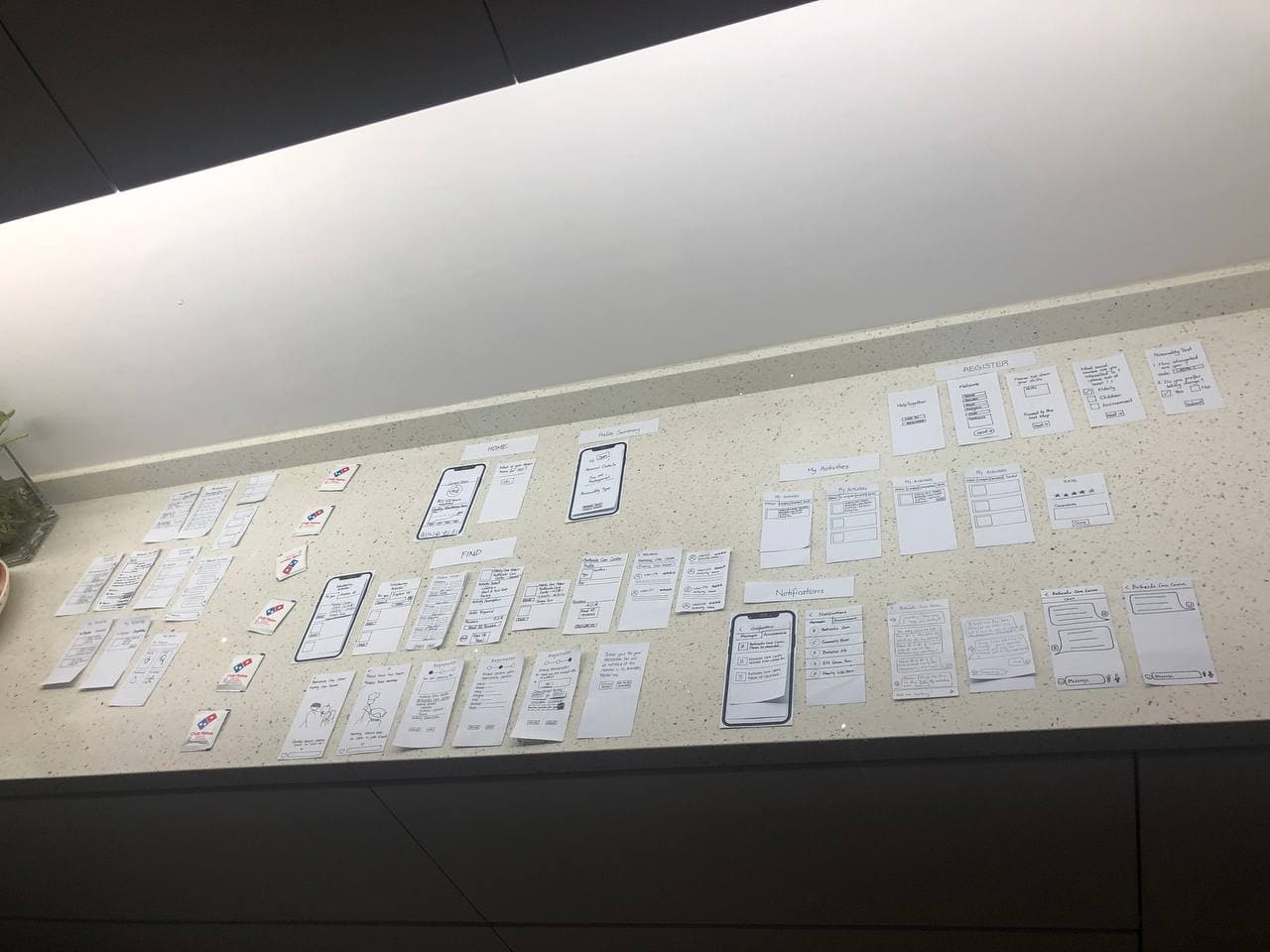
Paper Protyping Screens Overview
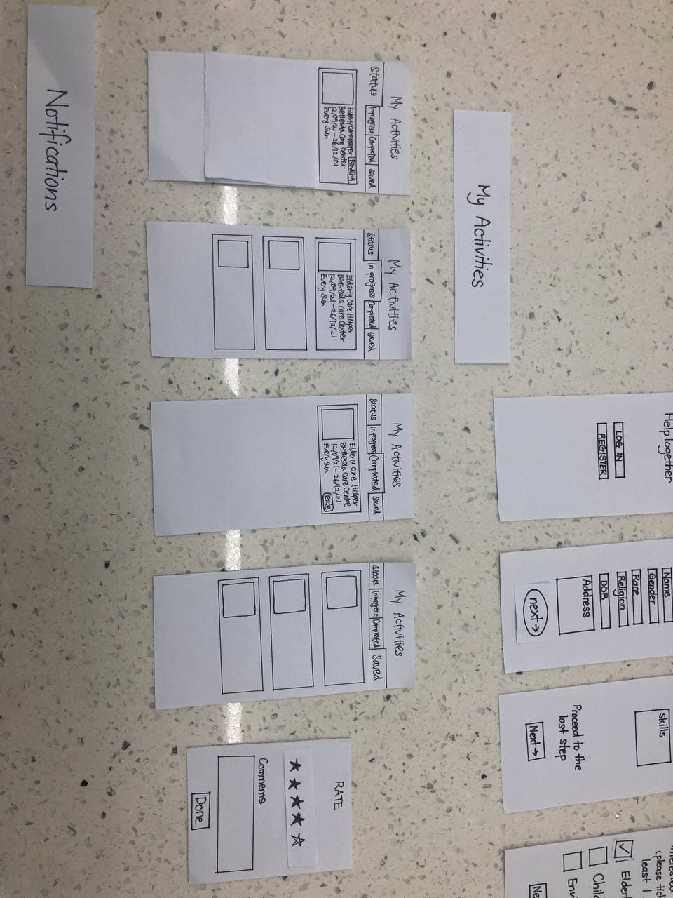
Close up of the activities page on the paper prototype
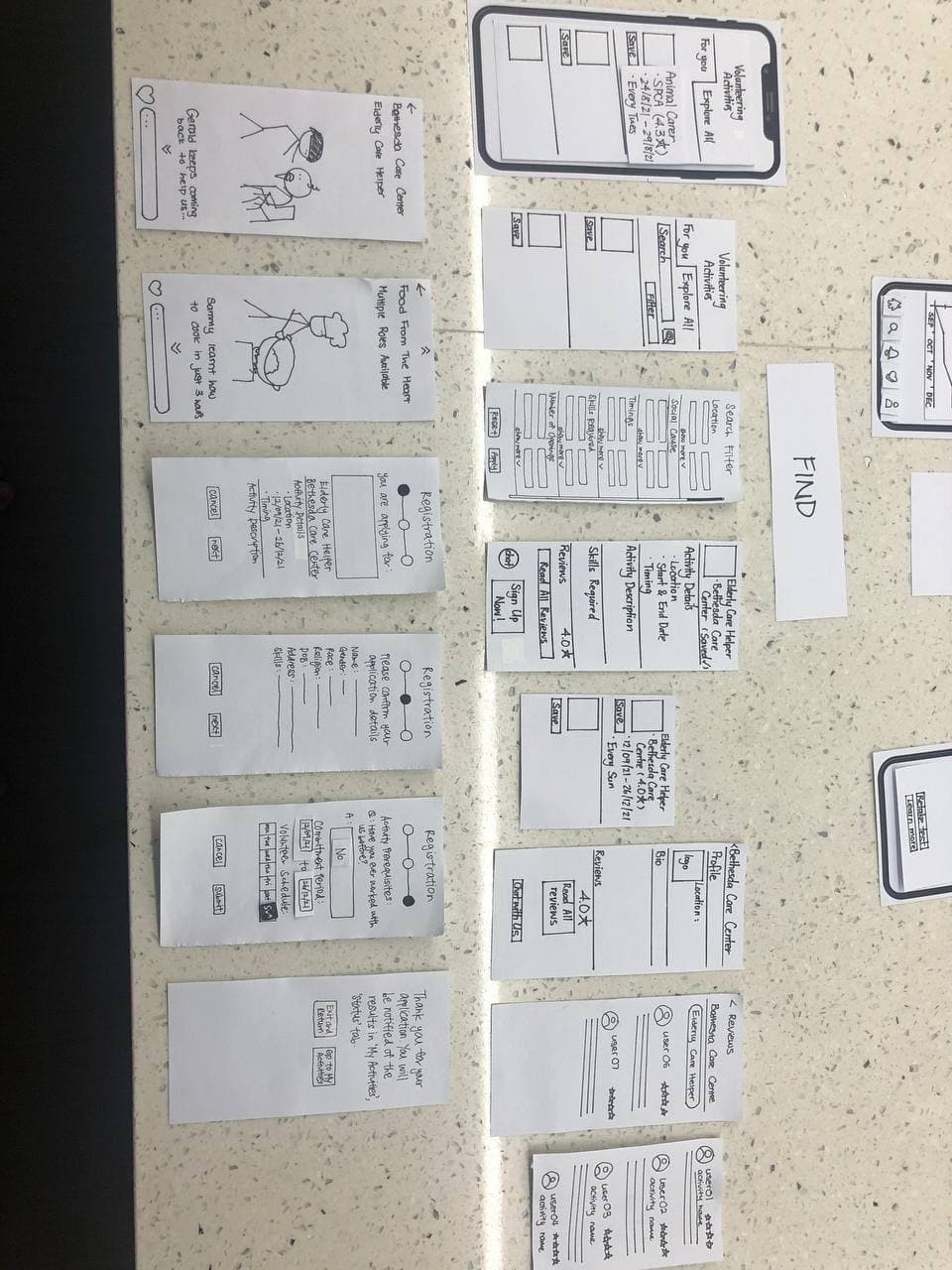
Close up of the ‘for you’ pages on the paper prototype
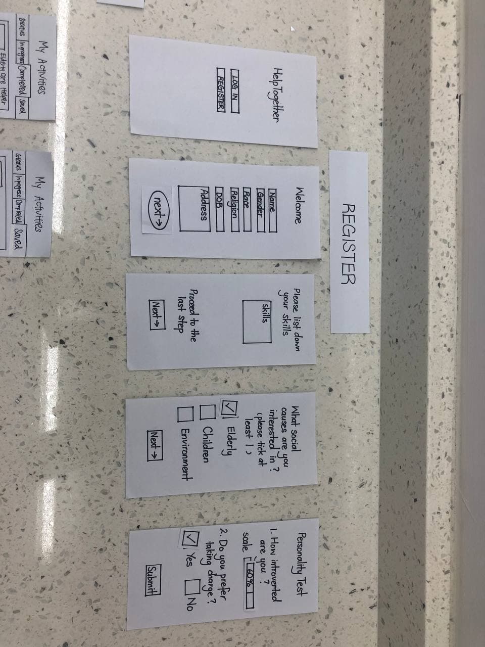
Close up of the register pages on the paper prototype
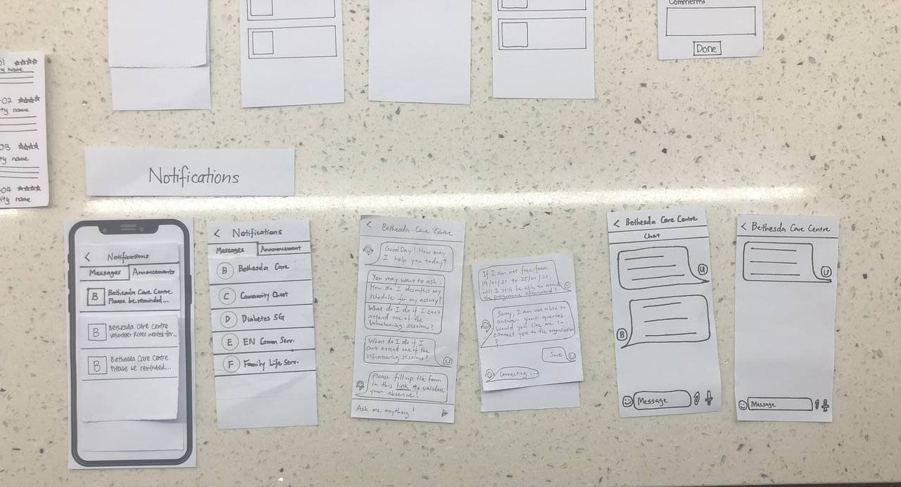
Close up of the notification pages on the paper prototype
Test Stage with Heuristic Evaluation (paper-prototyping)
Once our Paper prototypes were done, we proceeded to do an initial Heuristic Evaluation. Heuristic Evaluations are tests that do not concern users but instead use UX experts to run through the application. UX experts use guided UX principles to source key usability errors that might be present in the application. For this course, we were tasked with using Nielson’s 10 Heuristics
Using the heuristics, evaluators ran through our prototype video which we filmed. The prototype video used a ‘Wizard of Oz’ approach, where we had members doing videography while others were moving the prototype mid-script. Evaluators proceeded to give a severity score of 0 - 4, with 0 being not severe and 4 being a Usability Catastrophe, to the usability problems found.
After the Heuristic Evaluation, we compiled the usability issues given to us and proceeded to make changes during the next iteration of Design Thinking (Iter 2 where we focused on the Hi-Fidelity Prototype using Figma). See this post for how we transformed our paper prototype into a full-fledged working prototype with over 100 mobile screens.

